Tailwind CSS Color Tokens 🎨
Intro
Introduction to Tailwind CSS Color Tokens
In this workshop, we're going to define semantic color tokens in Tailwind CSS, to adhere to a convention set in a Figma design File.
We'll cover both Tailwind CSS v3 and v4 approaches 🔥
What this workshop covers
In this workshop, you will...
- Convert a Figma design to a Tailwind CSS project
- Define custom colors in the Tailwind theme
- Create a semantic color token layer in the Tailwind theme
- Replace "hardcoded" colors with semantic color tokens in the UI
- Leverage CSS variables to make the color tokens themable
- Support dark mode 🌑 and multiple color themes 🎨
- Port a JS Tailwind theme configuration (v3) to a CSS-only configuration (v4)
The Figma File
Semantic Design Tokens
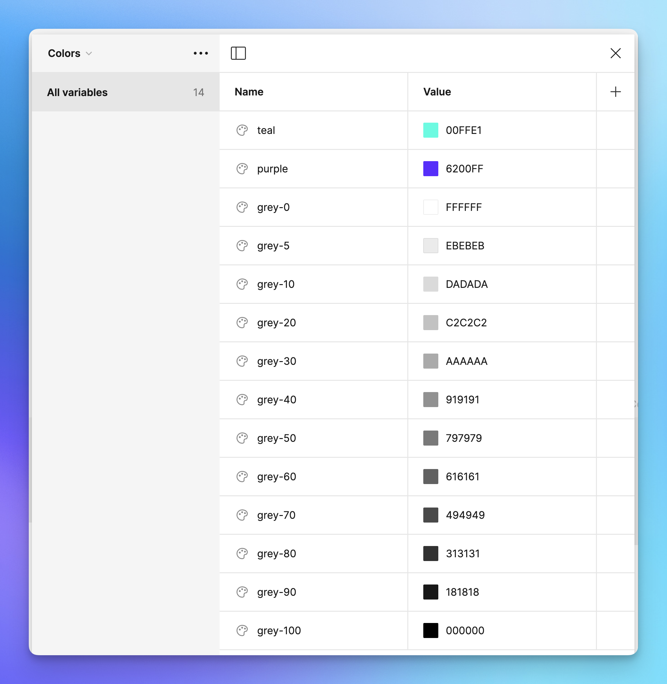
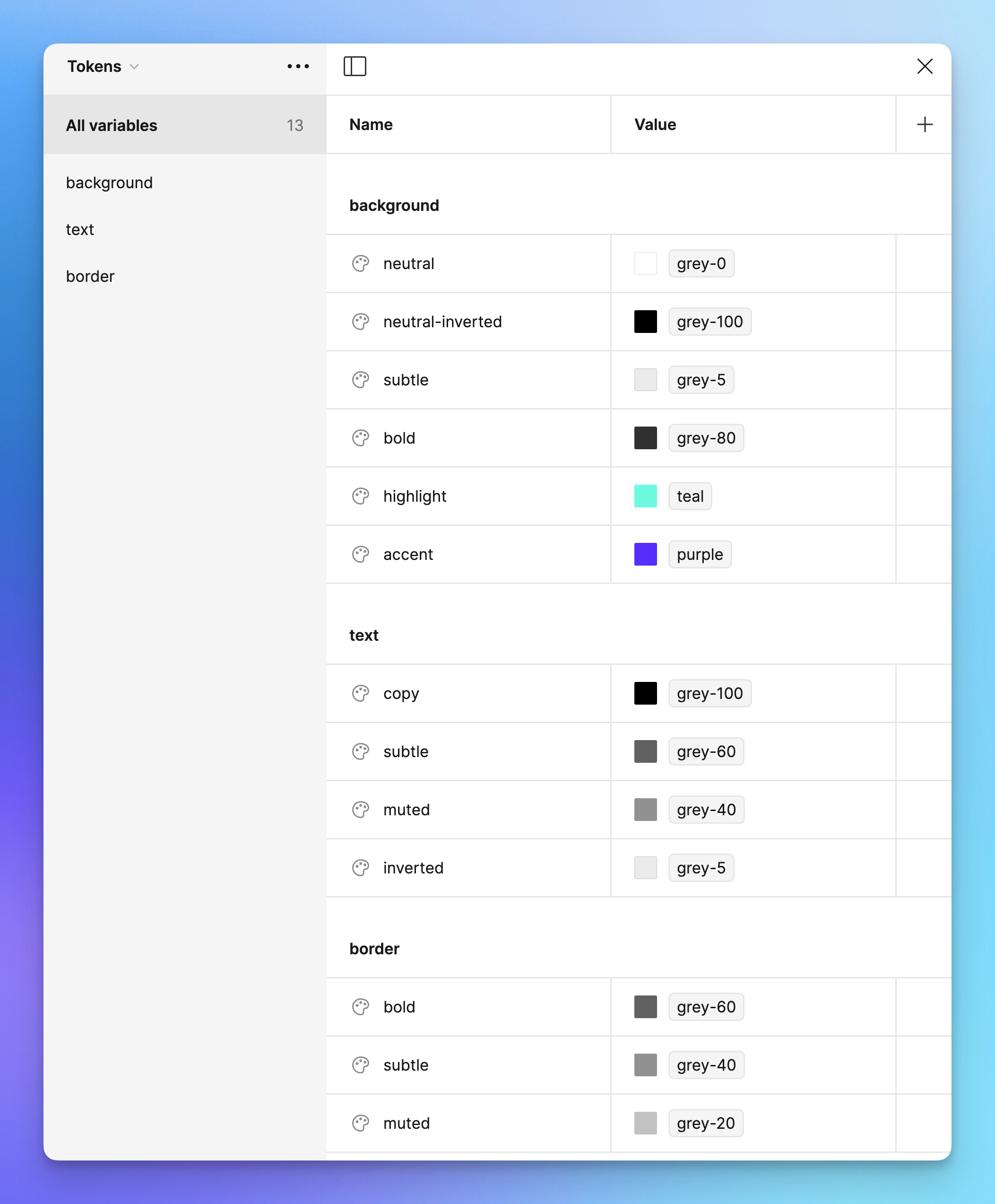
As you can see, colors are first defined as "raw" color palette values — but there is an extra layer of abstraction that defines semantic color tokens.
Those design tokens are scoped to background, text and border colors.
Color Variables in Figma
The design leverages Figma's variables to power the UI.
Raw color tokens
First, "raw" color accessors are mapped to the color values directly:
Semantic color tokens
Then, those raw color values are aliased to semantic color tokens:
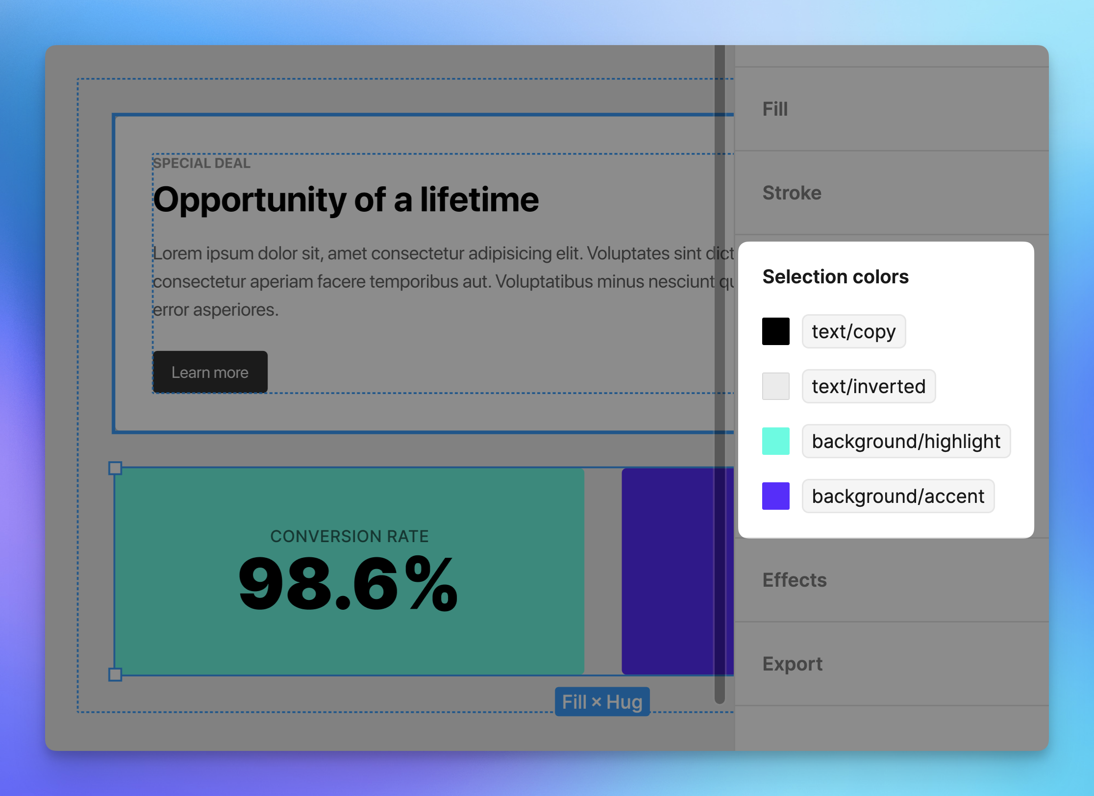
Usage in the design
The design is consuming these semantic tokens to compose the UI:
Multi-Theme Support
The idea behind this layer of design token abstraction: UI elements should not be directly connected to a specific color value — but instead us an aliased reference token.
This unlocks the ability to change an entire design system by changing the color tokens, opening doors to advanced theming strategies.
Unified Design Language
The semantic naming convention of these tokens also allows teams to better communicate about the design system, and to create a shared design language.
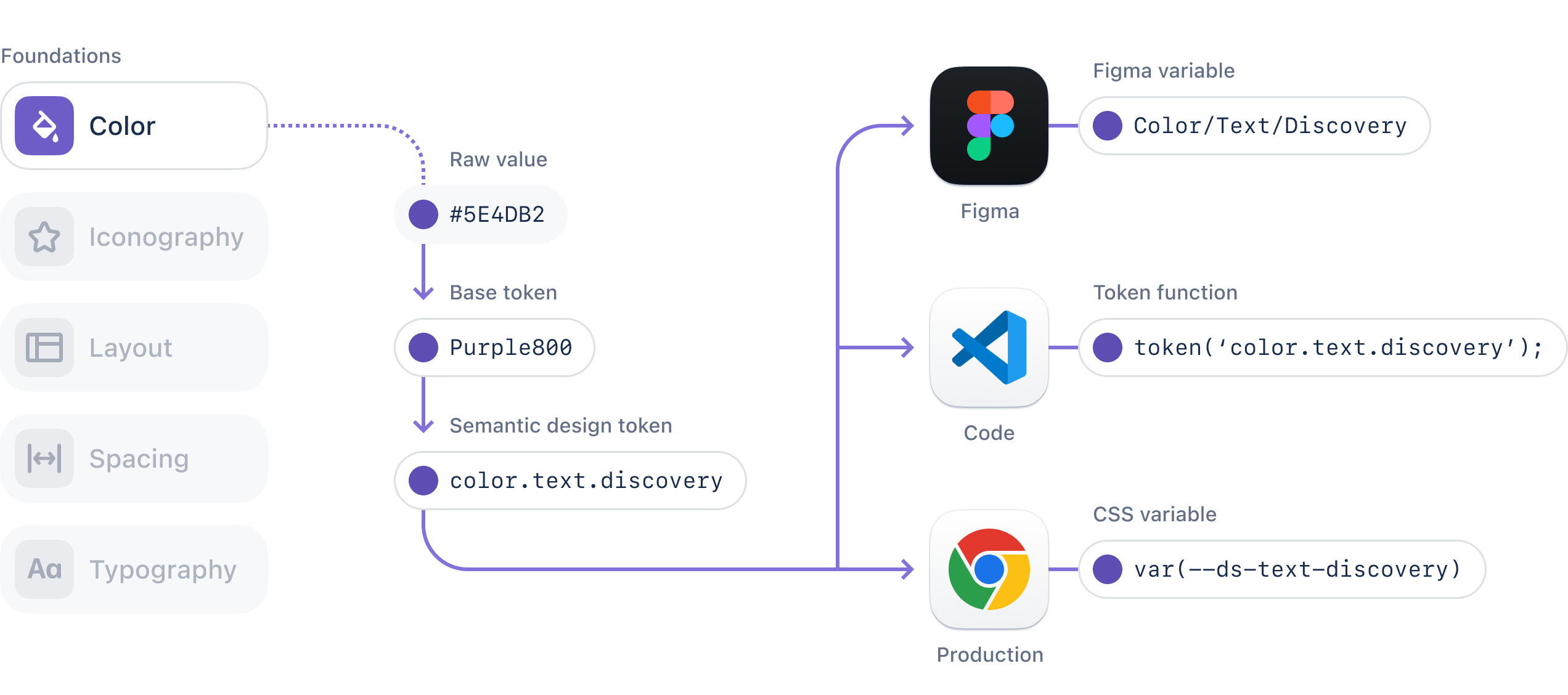
Here's a visual representation of this design token layer, as presented on the Atlassian Design System's Design Tokens documentation page:
Let's do this!
We've got plenty to cover. Whenever you're ready — let's dive in 🤿
🎵 Check out the workshop theme song! 🎶
Loading "Epic Web: Tailwind CSS Color Tokens Theme Song"